Quality improvement (QI) for the epidemiologist
More and more frequently I am being asked to evaluate quality improvement interventions. Recently I worked on a project that altered screening guidelines for Clostridium difficile in a hospital setting. The clinicians wanted to know, Did our QI project change the number of C.diff tests being ordered? The data are represented in a spreadsheet: each row in the spreadsheet is a C.diff test with a corresponding date. The intervention that changed the guidelines occurred on a specific date.
In some sense, this is not a traditional epidemiological application of biostatistics. Rather, it is a continual process improvement program to reduce unnecessary C.diff tests being ordered. As an epidemiologist I was not trained in quality improvement methodology (or its broader analog of implementation science*). The goal of the of this QI project was to answer the overarching question, Was the variation in tests ordered random or due to the intervention? QI is a whole field unto itself and this post is not meant to provide an overview of the field, nor convey all the ways to do this analysis. For that, see an introductory text, such as Measuring Quality Improvement in Healthcare or Dissemination and Implementation Research in Health: Translating Science to Practice. Rather I focus on a simple presentation of the data that can motivate a more thorough and complex QI program.
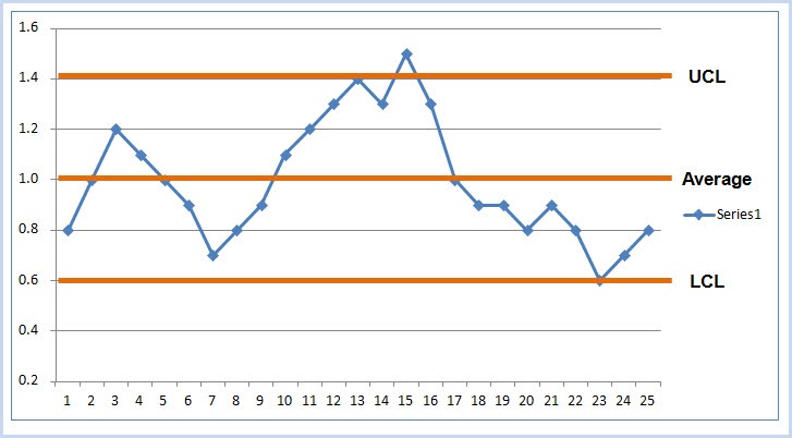
QI methods fall under two general categories: visualization of the data and analysis of the data. The first step should be to visualize the data. Can you detect trends? Does the variance change over time? One of the easiest visualizations is a run chart. In this type of chart, the x-axis is time, and the y-axis represents the outcome under study. The data need to be organized as time-series data: that is, measures of the outcome per unit time. The data dictate the unit of time. For example, in the C.diff study, the unit of time was a single day. The outcome was the number of C.diff tests on that day. The unit of time can be collapsed to examine trends by week, month, quarter, year etc. While this can make trends easier to visualize, it also results in loss of data.
There are various techniques to explore process and quality improvement as the result of an intervention. There are (interrupted) time series, statistical process control charts, regression analyses, and so on. Process control charts, of which the run chart is probably the simplest, is the technique of choice here. Users of R can turn to a package called qicharts2 that implements QI analysis and visualization for continuous data (using the function qic) and categorical data (using the function paretochart). As before, the goal is to differentiate random variability from non-random variability (aka, the signal or the result of the intervention).
There are a handful of methods proposed to detect non-random variability, all with the goal of answering the question, did some intervention result in a change? These are often based on an individual or series of time points occurring outside of a certain threshold (such as the 3-sigma limit, similar to a exceeding the confidence interval bounds). Visualizing a run chart of the data will allow an overall sense of the trends. The run chart includes the median of the data, and can be partitioned by pre and post intervention periods. A run of 8 points above or below the median indicates an intervention effect (using the so-called Western Electric rules). If a trend is detected in the run chart, then the analyst can explore more specific control charts based on assumptions about the data including its distribution and mean. See "Choosing the right control chart" on the qicharts2 vignette.
For those researchers interested in p-values of the QI analysis, there are a few different ways to generate these. A p-value for the overall intervention effect can be calculated through a non-parametric test, like the rank-sum test, comparing the distribution of values before and after the intervention. A p-value for the overall trend of the data can be calculated as a test for trend, using a linear regression predicting count by time. This can further be stratified by the intervention. Depending on the data, the researcher needs to be careful to guard against assumptions about these analyses that are not inherent in process control chart. For example, the C.diff dataset included multiple tests per patient, therefore each row (observation) is not independent of others.
*Implementation science (IS) has an interesting and perhaps at times controversial relationship with quality/process improvement science, as I recently found out. I view IS as the broader category of techniques of which QI/PI methodology is one instantiation of it that is particular to healthcare services research. IS is generally concerned with the methods for detecting a change in some programmatic/policy outcomes from an intervention and refining this over time. From chatting with several IS folks who work at NIH, the decision which methodology to use is really driven by the expectations of the funder. That is, if the funder/reviewers expect IS or QI methods, that should drive the choice of which to use. For example, NIH as a more pure research shop would expect IS, while AHRQ or PCORI that focus on patient outcomes would expect QI. This can be gleaned from past funded applications and study section composition and/or talking with the program official.Cite: Goldstein ND. Quality improvement (QI) for the epidemiologist. Jul 27, 2018. DOI: 10.17918/goldsteinepi.